In-depth guide to the Studio Compose template editor interface.
Parts of the Studio Compose Interface
Studio compose is the environment in which templates are created on the back end and is one of two options for displaying templates to end users on the front end. Below is an example of the Studio Compose Interface:

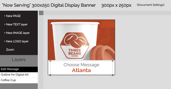
Name - appears in the upper left corner
Dimensions - appear after the name. These will be in the format entered in the template: inches or millimeters for print and pixels for digital.
Document Settings - link to change the document information. Takes you to the original pop-up if installed as a Master. You will need to access this to change the settings if installed inside a Campaign.
Top Right Buttons -
- Content Links - add or edit content links
- Save - saves your work
- Preview - opens a preview in a new window
- Finish - both saves your work and exits the screen.
Left-Hand Menu -
- + New Page - adds a new page to the document - these pages are visible on the right side of the interface.
- + New Text Layer - opens up an editor to add a new text layer
- + New Image Layer - opens up an editor to add a new image layer
- + New Logo Layer - (archived feature - no longer in use)
- Zoom - Opens a slider to zoom in or out of the document
- Edit Groups - this is a Longform document type-specific feature that allows Template Composers to group the display of layers together and to set the order of the groups and layers.
Right Hand Menu - The list of the pages in the document. Click the “clone/edit/delete” buttons underneath the page thumbnail to manage the page. Editing will open a pop-up to enable you to change the name of the page and specify a background color for the page. Background colors displayed here are ones that have been previously set up in your system.
You can drag the thumbnails to re-order the document pages.
Important Note about the Template Editor View (also called Studio View)
The template editor displays an image representation of the text and images used to build the template. This is to increase browser responsiveness for Admin and End Users alike. Therefore, there may be times when the color of an image may appear to be inaccurate or text may appear to be cut off within a text box. In order to accurately display the output, use the Preview option. The preview will generate an actual version of the final output, so Preview is invaluable when assessing what the final template should look like.
Content Interfaces
Two types of content can be added to a template: text and images
Text content is any content that is created via keyboard input and typically includes copy/type. In addition, custom icons can be set up as special characters in a font set and input along with the text. If you are interested in learning more about this, reach out to your Customer Success Manager.
Image content is everything else - photography, vector artwork such as logos, shapes, overlays, lines, etc. Image files must be prepared for CampaignDrive to properly display and output image content. The appendix of the IDML import documentation provides detailed instructions on how to prepare image graphics for use.
Z Order (Stacking Order)
The stacking order of template layers is determined by their position on the left side of the page. The top layer is at the top of the list and the bottom layer is at the bottom. Re-order the layers by dragging and dropping them in the stack.
Layer Indicators
A moving dotted line is used to show which layer is selected in the template. This is true for both the back and front-end interfaces. In addition, the selected layer will be highlighted in the left-hand menu.
Here is a sample of a highlighted text layer:

This is the back end of Studio Compose, where a Template Composer works.
In this example, there are three layers:
The Edit Message text layer is the top layer.
The Outline for Digital Ad layer is the second layer because it must lay on top of the Coffee Cup layer.
The Edit Message layer is currently selected and so the button corresponding to that layer is highlighted and there is a dotted line around the image.
Below is a screenshot of the same template but on the front end; notice that two of the layers are “missing.” The Outline for Digital Ad and Coffee Cup layers have been Content Locked and are not editable by the End User on the front end. Once again, the Edit Message layer is selected and is highlighted on the left, and has a dotted line around the text layer.

