![P9-Logo.png]](https://www.pica9.com/hs-fs/hubfs/Pica9/P9-Logo/P9-Logo.png?height=40&name=P9-Logo.png)
What Is the "Button" Experience?
Content in templates that are managed by the content database is accessible via a drawer on the right-hand side of the screen. (See screenshot below). All content using the same content link will appear within the same drawer, irrespective of whether or not the content is in the same layer or different layers.
Whenever content from multiple content links appears within the same text layer the drawer experience will change to create buttons at the top of the drawer to access every content link that appears within that layer:
We can use this feature to simplify the left-hand menu and to make all content accessible within the drawer at the same time by creating a text layer that has a field from every content link contained within it (the "Button Layer"). This ensures that every content link will have a link at the top of the drawer and users can click through the links to edit all the content at one time. We can then reduce the left-hand links by hiding all the rest of the layers associated with this content.
Back End
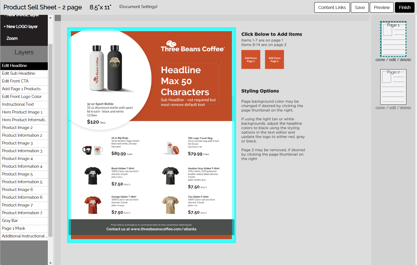
Look at the screenshot below of a template on the back end. Note the number of layers on the left-hand side. This is a lot of information for an End User to have to go through to edit the content.
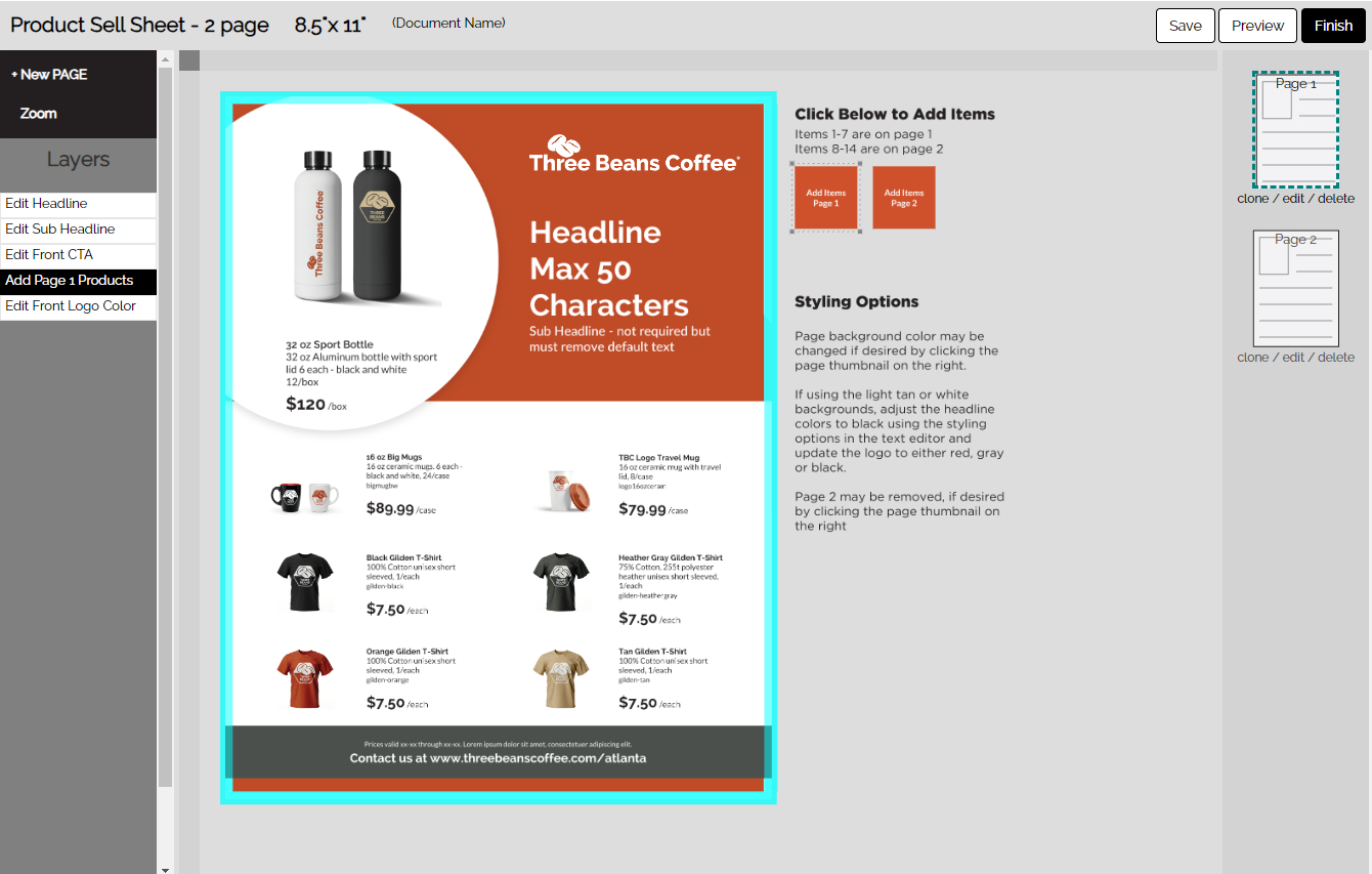
Front End
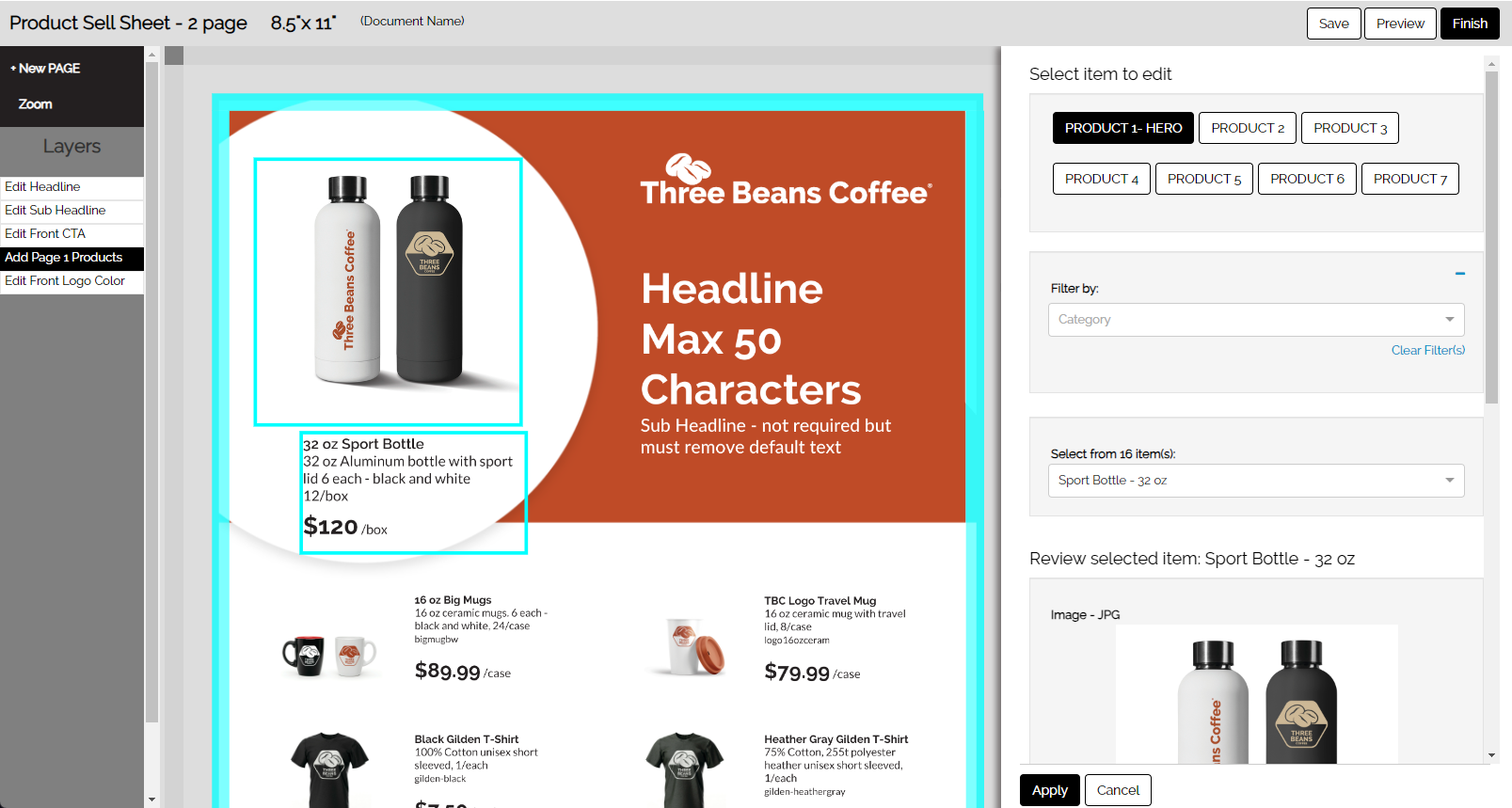
The screenshot below shows the front end of the same template. There are a couple of links on the left-hand side for the user to edit the copy and the logo, but all of the product information is accessed by the single link "Add Page 1 Products." There are also two "buttons" that have been created using the "Button Layer" technique discussed above. End Users can click on either the buttons or the link on the left. The buttons allow the user to access all of the product content without having to go to the second page of the template. Let's explore how this experience was created.
Creating a "Button" Experience
- Set up your Content Links to have consistent names that are meaningful to the end user, such as "Edit Product 1", "Product 1", "Product 2", etc.
- Set Up a Button Layer - The button layer is created after all content links have been created for the template.
- Create a new text layer.
- Add a content tag for each content link you wish to appear in the same drawer. In our example, we have broken the content links down by pages so all content from page 1 appears in one drawer and content from page 2 appears in a second drawer. You could have all the content within a single drawer. In this case, appropriate content link names might be "Edit Product 1 Page 1" and "Edit Product 12 Page 2."
- In some templates, this layer can arise naturally from content placement. In others, you might have to "force" content by creating an artificial field within your content category.
- Important: Any field used for your button layer will appear to the end user as a content field. If an artificial field has been used, this field should be blank and be content-locked and, ideally, named so that it lies at the bottom of the drawer.
- Style the button layer
- Use the "text layer background color" option in the editor to color the text box
- Place the button where you wish it to appear and size the box as you wish.
- Type in the button text.
- Position-lock the layer.
- Add any informational text you wish as a separate text layer.
- Position and Content-Lock all other layers associated with the content links. The only time you would not content-lock a layer would be an image layer that allows cropping. To allow cropping by the End User, content-lock must be turned off.
The Button is Optional
The "Button" experience is really just consolidating or grouping the content links. In the experience above we don't really need the button. The link on the left-hand side of the page will also access the drawer. The button is generally used in conjunction with other informational text to guide the user or in a situation where we want to have content across pages accessible in a single drawer..
Setting Up the Content Database for the "Button Experience"
The following screenshots show all the steps used in creating content links for a sample template that uses the "button experience".
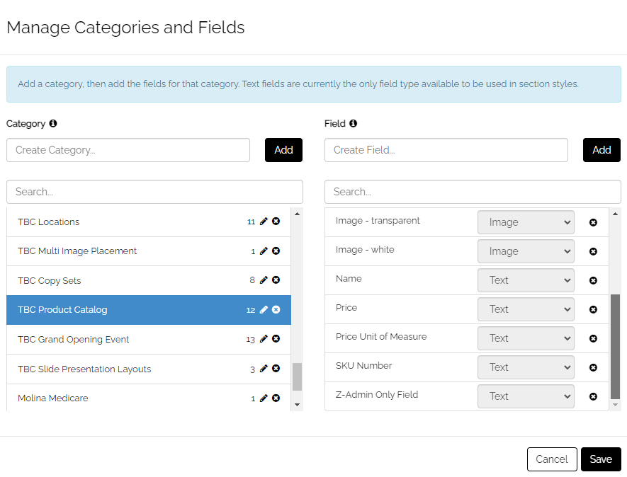
The Content Category
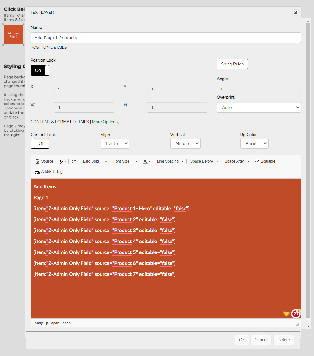
This content category shows the content category fields used to populate our sample. Note the "Z-Admin Only Field" at the bottom of the list. This will be used to create our Button Layer (remember that "artificial" field mentioned earlier?).
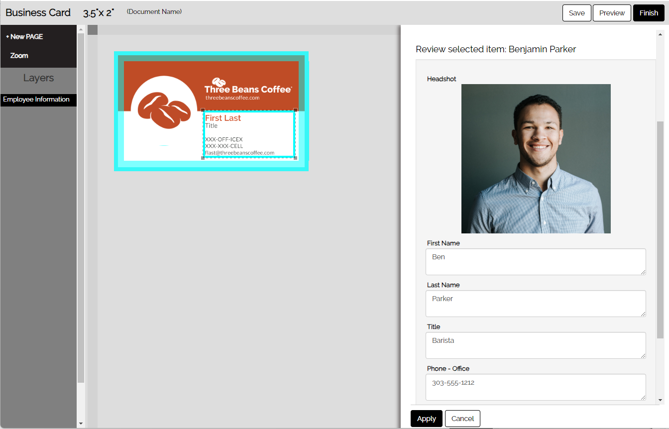
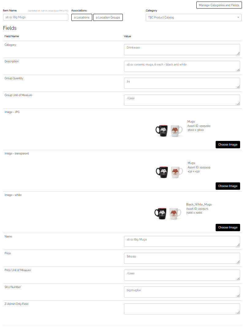
This is a sample of a content Item created for the category shown above.
Note that our "Z-Admin Only Field" is blank.
This is a Content Link for our Template
This is a sample of one of the content links used in our example:

This shows the content drawer on the back end with all the content links.

This shows our "Button Layer" with all the content links applied for the "Add Items Page 1" button
Note the field name: "Z-Admin Only Field"