![P9-Logo.png]](https://www.pica9.com/hs-fs/hubfs/Pica9/P9-Logo/P9-Logo.png?height=40&name=P9-Logo.png)
The first step to coming up with a new homepage design is coming up with the content and overall look-and-feel. Take the time to really think about and research what content should be available on the homepage. This will save time as the process moves from ideation of a new homepage to the production (creating the assets to build the home page).
Some questions to ask before designing a custom home page:
- What types of content do my End Users need regularly?
- What pieces of content (images, graphics and text) do I want to add more style to?
- How much time am I willing to spend on a new homepage design?
- How much time am I willing to spend maintaining a custom homepage design?
- Will I need to make multiple site parts to account for regionalized home pages?
To create a completely custom home page the standard layout will be hidden entirely and the page will be built with a single or a series of site parts, a CampaignDrive feature that allows the placement of custom content at the top of any page inside CampaignDrive. Before building a design, it is important to understand the features of site parts, to ensure that the design can be executed faithfully.
Design Tools Available In Site Parts
The design canvas in site parts consists of a WYSIWYG editor with certain editing functions. Layouts are built using the editing functions. One important fact to remember is that site parts produce a s a single column layout only. Images may be placed next to each other to achieve multi-column effects , but there is no option for multi-column text or a true multi-column layout
Live Text: Text can be typed directly into the editor and styled using the text formatting options and the font and font size drop-down menus. Custom colors may be added by selecting from the color grid provided or entering the hex value. The only fonts available in the editor are those found in the drop-down - fonts installed for template building are not available here.
Images: Photos and graphics may be added into the site part by clicking the small image icon. The image can be a jpg, png or GIF. Animated GIFs can be used to mimic carousel effects, however, since they are a single image, they can only have one link applied, so the entire GIF will point to a single re-direct (more on links below). Clicking on the icon will bring up the image editor:
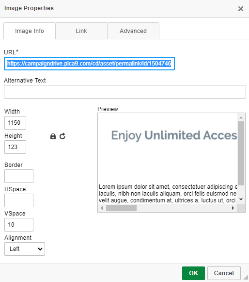
An image used in a site part is placed with a URL. Best practice is to upload the image to the media library and reference the image, however externally hosted images will work as well. The URL for images hosted in a CampaignDrive instance looks like this:
https://{Instance URL}/cd/asset/permalink/id/{Asset ID}
The image width and height, border and any padding and alignment are set with the controls in the editor.
Hyperlinks: Links can be applied to both test and images. For text, highlight the relevant text and use the "link" icon to create a hyperlink. For images, click on the "Link" tab in the image editor to set the target URL.
Once the design parameters of site parts are well-understood, the team can draft and refine a layout that can be supported by site parts.
Note for Custom CSS: If custom CSS has been added to the CampaignDrive instance to update the system font to a brand font family, then the preview/text alignment in the site part builder will not be accurate and will need to be adjusted through previewing the site part.
Creating the Site Parts
Once the design has been created, go to the site parts section of the Admin area and create the site part layouts to support the design. The site part URL will be /cd/index/home for site parts appearing on the home page. If the layout requires more than one site part, use the "Order On Page" field to place them in the proper order. It is recommended that these be left as "Inactive" until all design is complete.
Applying the Custom Layout
Hiding The Default Layout
When using a completely site-part based layout, the default layout must be hidden. This is done by going into the Theme Manager in the admin section, clicking the "Advanced Settings" button and placing the following code to hide the original tiles:
.item-list {
#one, #two, #three, #four {
display: none;
}
Applying the Site Part
Once the original layout is hidden, the site part (or parts) may be activated.
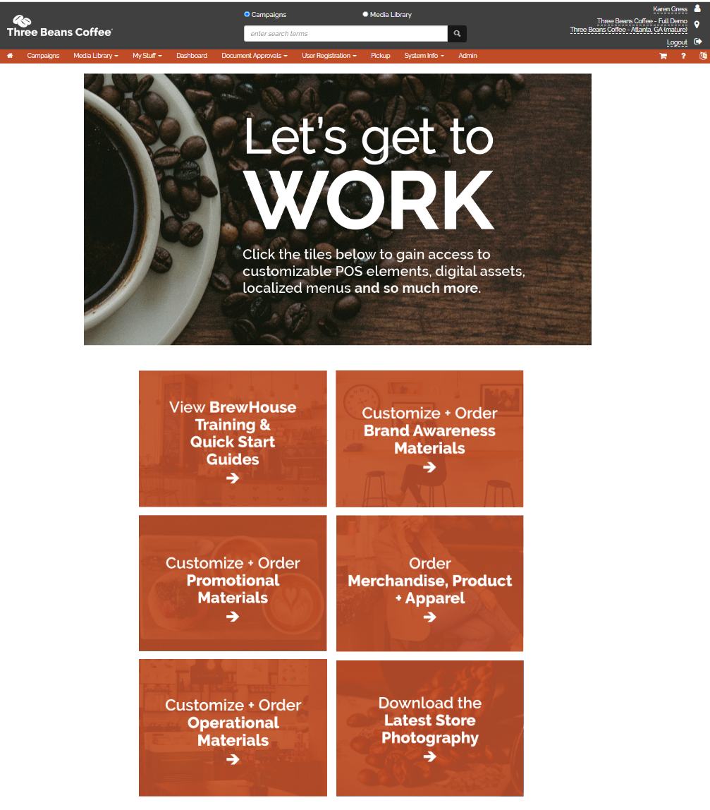
Sample of a Site-Part Based Homepage Design
This layout was produced by creating 7 different graphics based on the planned design. These were then uploaded into the Media Library. Then the designer opened the site part builder and used the "image" icon to add the images to the site part. Links were created to point each image to the appropriate page.
Custom Home Page
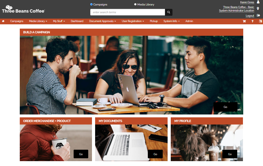
Original Four Tile Layout
Site Part Editor

Testing Homepage Layouts Before Going Live
Depending on how extensive the homepage layout changes are, it might be a best practice to add a "testing" region to the CampaignDrive instance to test the layout, graphics, and text itself and gain approval before going live. There will need to be a location that is tied to this "testing" region and the site part will be assigned to this region in order to view and adjust the home page design. Once the design is finalized, the region may be removed and the home page will be visible to everyone.
Regionalized Site Parts
For CampaignDrive instances that use regions not just for testing, custom home pages built with site parts can be used to create customized user experiences.