In this case study, Three Beans Coffee will identify three use cases/user groups and how these user groups are served with different custom and regionalized homepages.
The Scenario
Three Beans Coffee is a franchise-oriented brand that segments content based on how long a store has been open. This segmentation uses regions for content and reporting. Since site parts can be segmented by region as well, Three Beans Coffee has customized the homepage layout to provide targeted access to materials that each group needs, as well as providing messaging unique to each user group.
The User Groups
New Stores: Stores that have been open six months have content that is oriented to getting a store started and getting the End Users familiar with the system. They do not have access the full range of materials.
Mature Stores: Stores that have been open more than six months have more advanced campaigns geared towards promotions and brand awareness and do not need to see the new store activation materials.
System Administrators: System Administrators have access to everything and need to navigate quickly.
The Set Up
Since Three Beans Coffee uses regions for segmentation, customized site parts could be created and assigned to each region to provide a unique home page experience.
The Designs
The designs were developed outside of CampaignDrive and went through several rounds of testing and approvals before deciding on a final set of tools and layout for each user group. The individual site parts were created based on these designs.
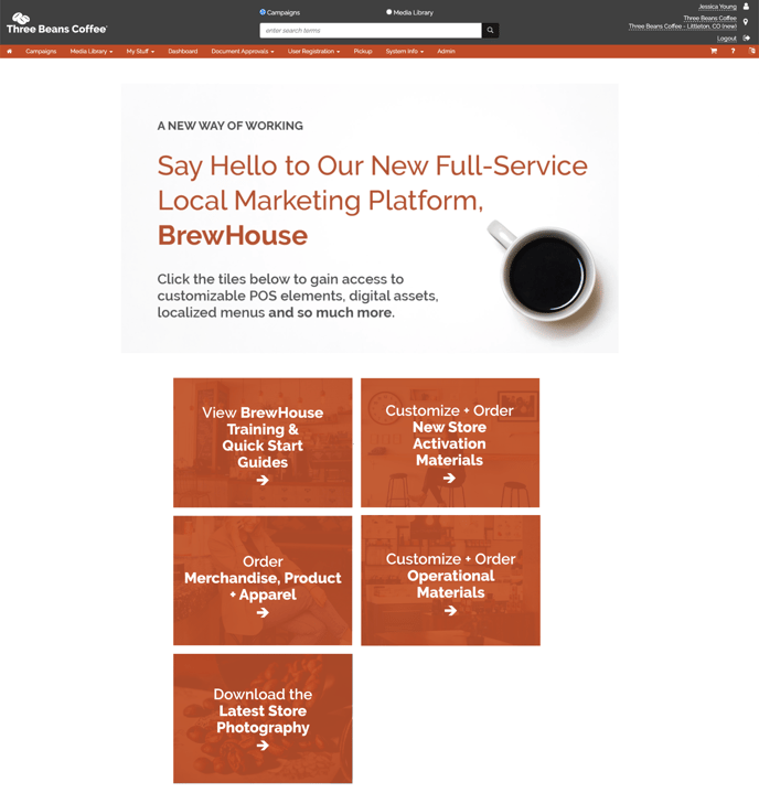
The First Design: The "New" Location Homepage

The "new" location has five clickable buttons to choose from, which are based on the needs a new location team would have when opening a store.
- View BrewHouse Training & Quick Start Guides
- Customize and Order New Store Activation Materials
- Order Merchandise, Product + Apparel
- Customize + Order Operational Materials
- Download the Latest Store Photography
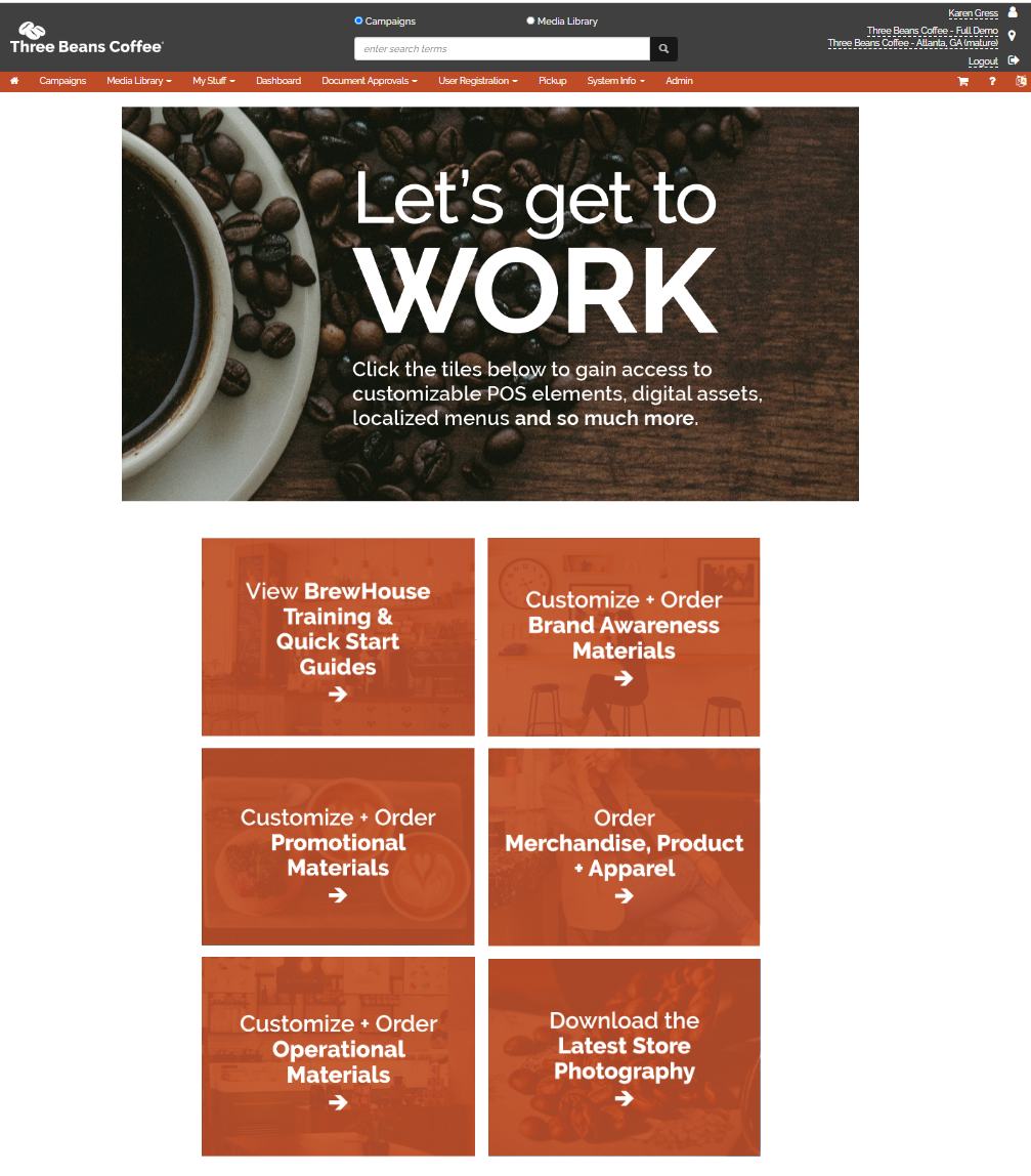
The Second Design: The "Mature" Location Homepage
The "Mature" location has content that is similar to the "new location" with a few key differences.
- Their hero message has been updated both to provide a visual cue that their page has changed as well as updated messaging more focused on a mature store.
- The "Mature Location" now has access to the "Customize + Order Brand Awareness Materials" and the "Customize + Order Promotional Materials" buttons based on the idea that stores that have been open six months are shifting away from "getting the store open" to now advertising their presence and are looking to increase foot traffic.
- The "Mature Location" no longer has a link to the "Customize + Order New Store Location Materials" because this campaign is no longer available to Mature Stores.
The Third Design: The System Administrator Homepage

The System Administrator location has a completely different "look-and-feel" from the End User homepages to (1) notify admins that they are in the System Administrator location and (2) to give easy, above-the-fold access to materials System Administrators might need. The End User homepages are more about delivering a focused experience and the System Administrator homepage is about functionality.

