If I had to name one type of job that has a tendency to get on the nerves of studio professionals, I’d put my money on the last minute advertising resize.
You know the drill. It’s 2 pm on a Friday afternoon, and you’re just beginning to let thoughts of the weekend dance in your head, when all of a sudden there’s an email in your inbox with an all-caps subject line: “URGENT! Pub needs these ad materials NOW!”
Sigh.
Your client (or colleague, or franchisee, or whatever) has attached a JPG of an ad that was built three years ago, with chicken-scratch markup to indicate what they want changed – in the headline, the body copy, the hero image, the contact details, etc. Pretty much everywhere.
To make matters worse, the ad is a half-page vertical, but your client (or tormentor, or whatever) needs it to be a quarter-page horizontal, destined for a publication that buries its ad specs somewhere in the nether reaches of their website and that wouldn’t know a Standard Advertising Unit (SAU) if it bit them on the ankle.
Sigh again.
You pop over to the DAM, to see if you can find the original art files for the source ad, in the hope that you won’t have to rebuild the thing from whole cloth. But then you remember—oh, yeah!—your organization hasn’t sprung for a true DAM just yet. So your remaining option is to comb through two or three dozen Box (or DropBox or WeTransfer or whatever) with hopes of an early departure fading faster than an uncapped Sharpie on a hot summer afternoon.
You fire up InDesign, pop your spectacles into place, and start squinting at the markup and cramming content into the specified size. You find yourself making all sorts of compromises, because the deadline is hours, or minutes away, and your ad requester is starting to fill your inbox with less-than-friendly pings at the rate of about three per minute.
In the end, of course, you get the job done (don’t you always?). And you think to yourself that there’s got to be a more systematic way.
But then, the weekend arrives, and by Monday morning, the crush of typical events crowds out all best-laid process improvement plans of mice, designers and, yes, men.
There it is. The ad resize. As my old partner (an account guy “suit” if ever there ever were one) used to say, on his way out the door for the weekend, “You can just dash that off, right? Gotta go!”
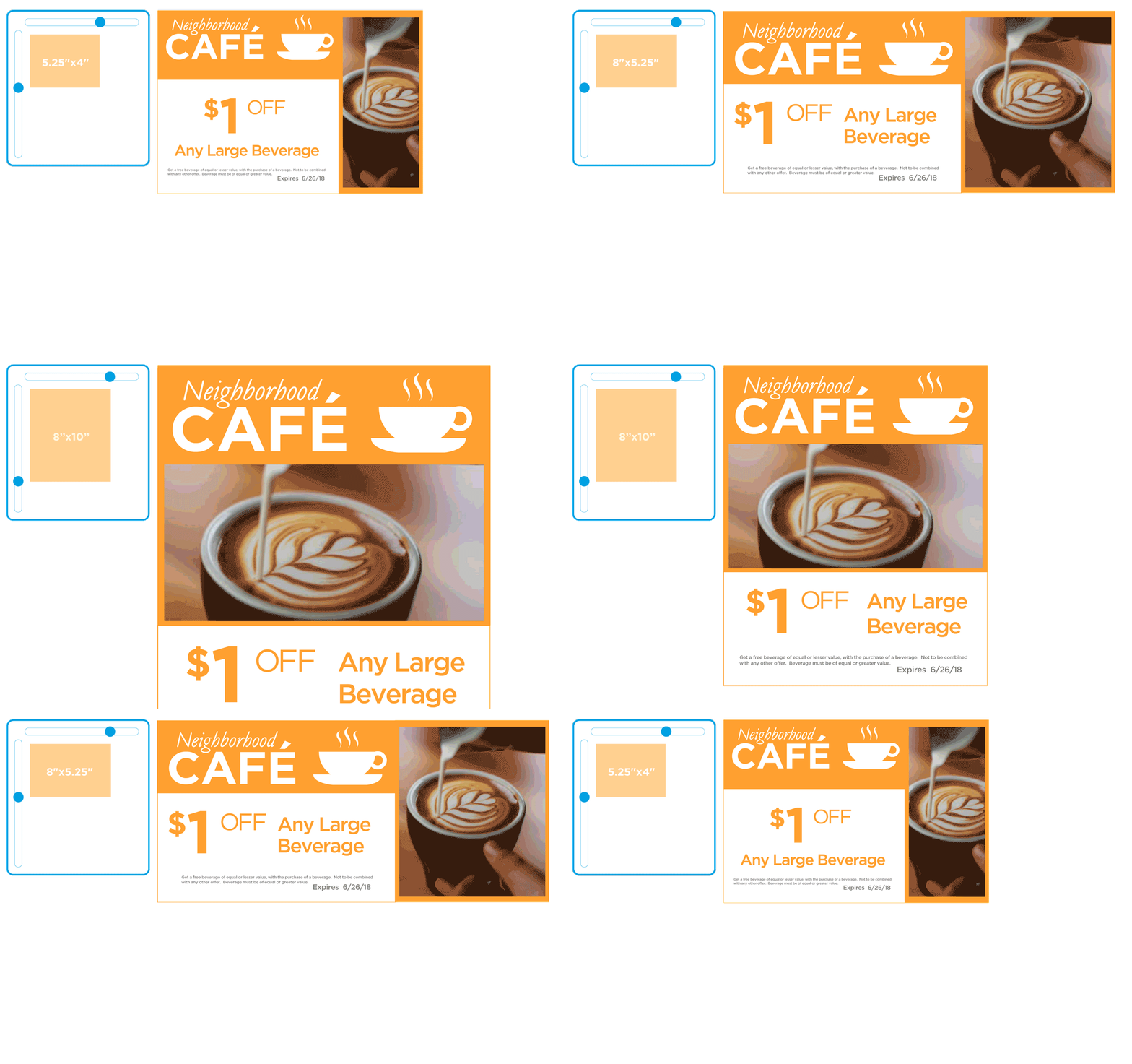
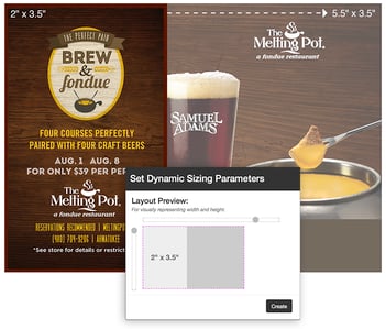
Having lived this particular dream on multiple occasions, we made dynamic ad-sizing one of the first major feature enhancements of our CampaignDrive platform. And in the years that have passed since we released that feature, we’ve seen hundreds of thousands of ad resizes executed by the system.
That’s given us some interesting learnings on what users need in a resize. Here are just a few:
- Users today can crop photos with little to no trouble. More than 98% of the dynamically sized ads that were submitted on CampaignDrive platforms in 2021 with re-cropped photos were approved without brand-level changes. For whatever reason (perhaps the rise of the iPhone camera), our local marketers are demonstrating that they have visual sensitivity and are willing to apply it—especially when an ad-materials deadline looms large.
- Appropriate type scaling is more an art than a science—and it shows in ad resizes. When users were given the freedom to select type sizing in dynamically sized advertising layouts, the approval rate dropped significantly—in many cases, below 50%. Common mistakes included:
- Awkward line lengths relative to type size (damaging legibility)
- Inappropriate line-breaks, including near-widows, and near-orphans.
- Typographical errors, even when starting with a brand-supplied copy “base”
- Logo sizing and clear space were almost never an issue. Across thousands of automatically sized executions, the worry that loomed largest in designers’ minds almost never turned out to be an issue.
- Legal disclaimers and disclosures caused the largest single roadblock to same-day executions. Although our dataset here was somewhat small, the support chatter that we heard around dynamically sized advertising placements shows that last-minute legal review is still not a “thing” in most brand environments.
So, what do we recommend to help relieve resize related headaches?
Give your franchisees more freedom with the imagery, and you’ll be surprised by the quality (and the gratitude) that you’ll see in return.
Help your local marketers keep their hands off the body copy whenever possible. It will read better, and will look better, if you let your design rules govern the execution of copy.
Build your ad templates from the logos and legal up. If you’re going to spend time in template composition, spend it here, and you’ll earn outsized returns in efficiency over the life of the campaign.

Harness The Power of Dynamic Sizing and Templating With CampaignDrive by Pica9
CampaignDrive by Pica9 is the leading SaaS local marketing platform that transforms your brand assets into creative, dynamic, and ready-to-use templates. This cloud-based tool enables in-house marketing teams of distributed brands to seamlessly customize dynamically sized marketing materials and promotions for each location, while maintaining brand consistency. Click here to learn more.


